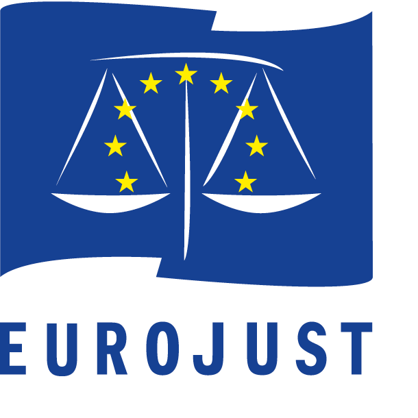
New logo proposal for Eurojust – the European Union’s judicial cooperation
Eurojust, the European Union’s body for judicial cooperation against serious and organised crime, has launched a contest to obtain a tentative new logo and graphic identity. The aim of the contest was to consider a possible update of the Eurojust logo, to make the body more distinguishable and recognizable to its stakeholders and the general public.The aim of the contest is to develop a distinctive new logo for Eurojust. The logo must incorporate one or more key elements of Eurojust’s mission. My submission to this contest was ranked among the 4-10 best entries, out of 696 submissions in total.
Equality as symbol of the project
The equality is the first value which I wanted to transmit in this project. Justice has credibility only if it is equal for all. Europe has the duty to be a symbol of equality, only in this condition it can be considered as an area of justice.
To represent these values in the project, I drew the logotype with characters which allowed an equal weight between EURO and JUST. Indeed, the name “Eurojust” clearly evokes the union of justice with Europe. I estimate that these two elements must have the same weight to give an impression of equality.
Modern typography
The font is based on a modern typography sans serif which allows a good flexibility of reproduction, it has a strong impact and remains very readable.
In addition, the European Union flag symbol should be used according to the guidelines.
The design proposal must utilise the word ’Eurojust’ clearly in the logo, and must also include a pictorial symbol.
Symmetry as structure of the design
Symmetry is very present in structure of the project because it considers same manner two elements opposite. Europe and justice are confronted symmetrically to reinforce the value of equality. The European flag is divided into two to accomodate Europe and justice in an equal way. The balance weighs stars in perfect equity while wanting to represent the various Member States in equilibrium.
The work is with Adobe Illustrator realized considering the guide line colours of the Euro flag: 100% cyan – 80% magenta for the blue and 100% yellow for the stars.
Following this link, you can read others projects of corporate identity also restyling of logotypes.


